
-
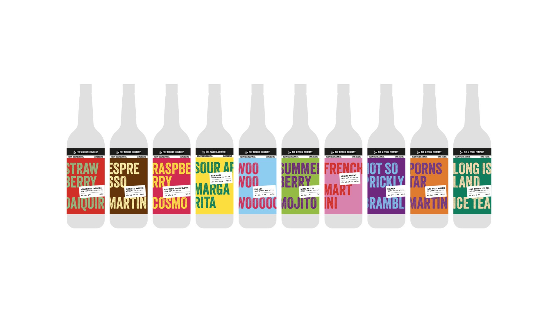
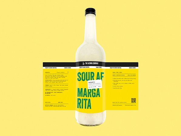
Create a series of labels for The Alcohol Company’s debut range of pre-mixed, mix-at-home cocktails.
-
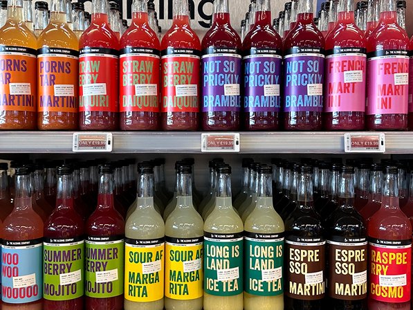
The product branding needed to stand out in a saturated market, especially since the shop would also be stocking competitors’ products. The client was aiming to have it on shelves before Easter, which meant the labels had to be ready for print within two weeks.
-
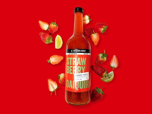
After researching competitor brands, I noticed a common trend: bright colours paired with simple illustrations. To stand out while staying relevant, I leaned into this aesthetic but made it better, using bold, contrasting colour pairings across all ten flavours. Each label features its own vibrant combination, while still feeling cohesive tonally as a full range. This was paired with a strong, impactful typeface to solidify brand recognition. The distinctive branding helped drive over 300 bottle sales the day before the product officially launched on social media.
Concept | Strategy | Design | Art Direction | Packaging | Roll Out


